Histogram Example
(Qualitative Data)
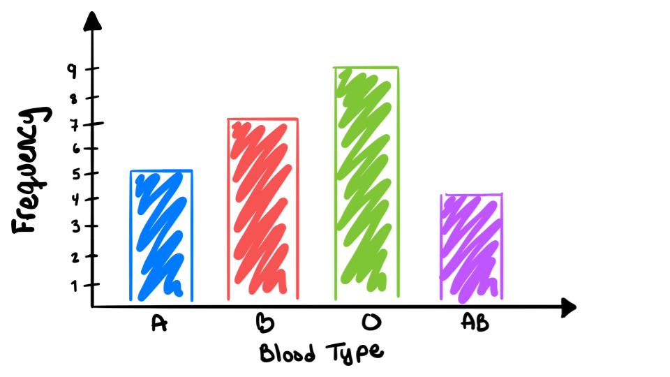
For this example lets use the blood type data from the Now You Try! activity. The frequency table is given here:
| Class | Frequency |
| A | 5 |
| B | 7 |
| O | 9 |
| AB | 4 |
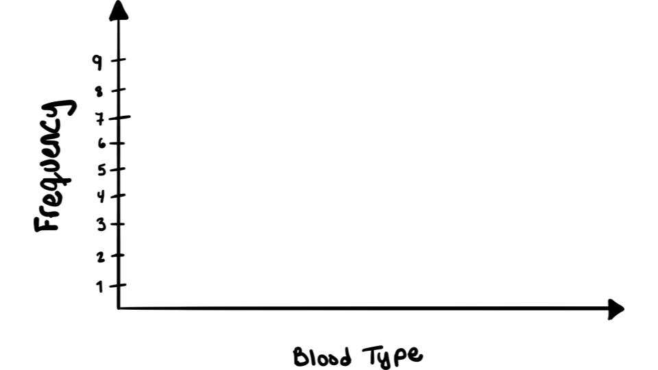
Step 1: Label the \(y\)-axis with units for the frequency and label the \(x\)-axis

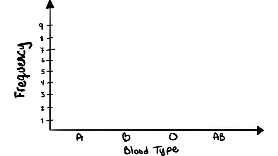
Step 2: Label the \(x\)-axis with your classes

Step 3: Plot your frequencies with boxes!

To see this done watch the following video: